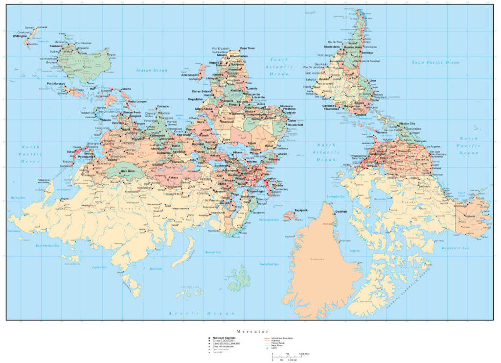
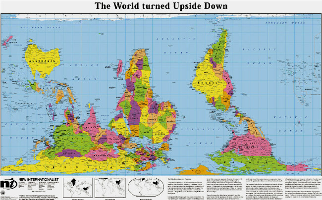
 This is another way of looking at the world. Notice the sizes of the different continents in comparison to each other when you see it from this point of view. Could our traditional maps have given us some wrong ideas? Look how small the USA seems in comparison to the whole continent of Africa. It’s amazing how simple information that we have been exposed to over the course of our lifetime molds our thoughts. It’s all about perception.
Below is another example of an “upside down map” which shows that ALL maps have some interpretation. Notice the size of Russia and Greenland in this map. The significant point is that it is impossible to have a 100% accurate representation of our world. Whether it is a map, a history, or any other subject, it is important to get as close to the truth as possible, but to realize that many people may want to manipulate our thinking based on their personal agenda.

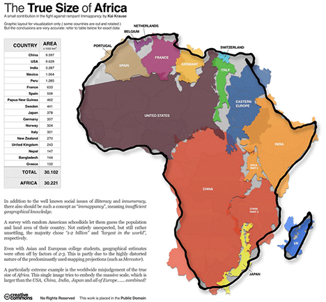
And, having spent 30 years living in South Africa, this is probably my personal favorite. Notice how vast the continent of Africa is in relation to the rest of the world!
 As thinking people we owe it to ourselves to ask hard questions in every subject. Don’t accept the perspective you were taught. All history. All maps. All subject have a bias. We need to know what the bias is and seek to get as close to the truth as possible.
Perhaps some of our long held views in other important areas like health and vaccines have been subjected to bias and misinformation. We need to dig deeper than the surface information provided by those who will benefit from our acceptance of their point of view.

I’m wishing for a like button. 😉